Color theory serves as the foundation behind how we perceive, mix, and use colors. It plays a crucial role in various fields like digital design, printing, photography, and art, helping creators achieve the exact look and feel they want. Whether it's about making a design feel harmonious, choosing a paint for a new room, or calibrating a printer, understanding the underlying science of color ensures better and more predictable results.
This blog aims to delve into the physics of light and color, explore different color models, and uncover the technical details behind how colors work together. Whether you're a professional designer or someone who loves learning about colors, this guide will offer insights into the science behind what makes color such a powerful tool.
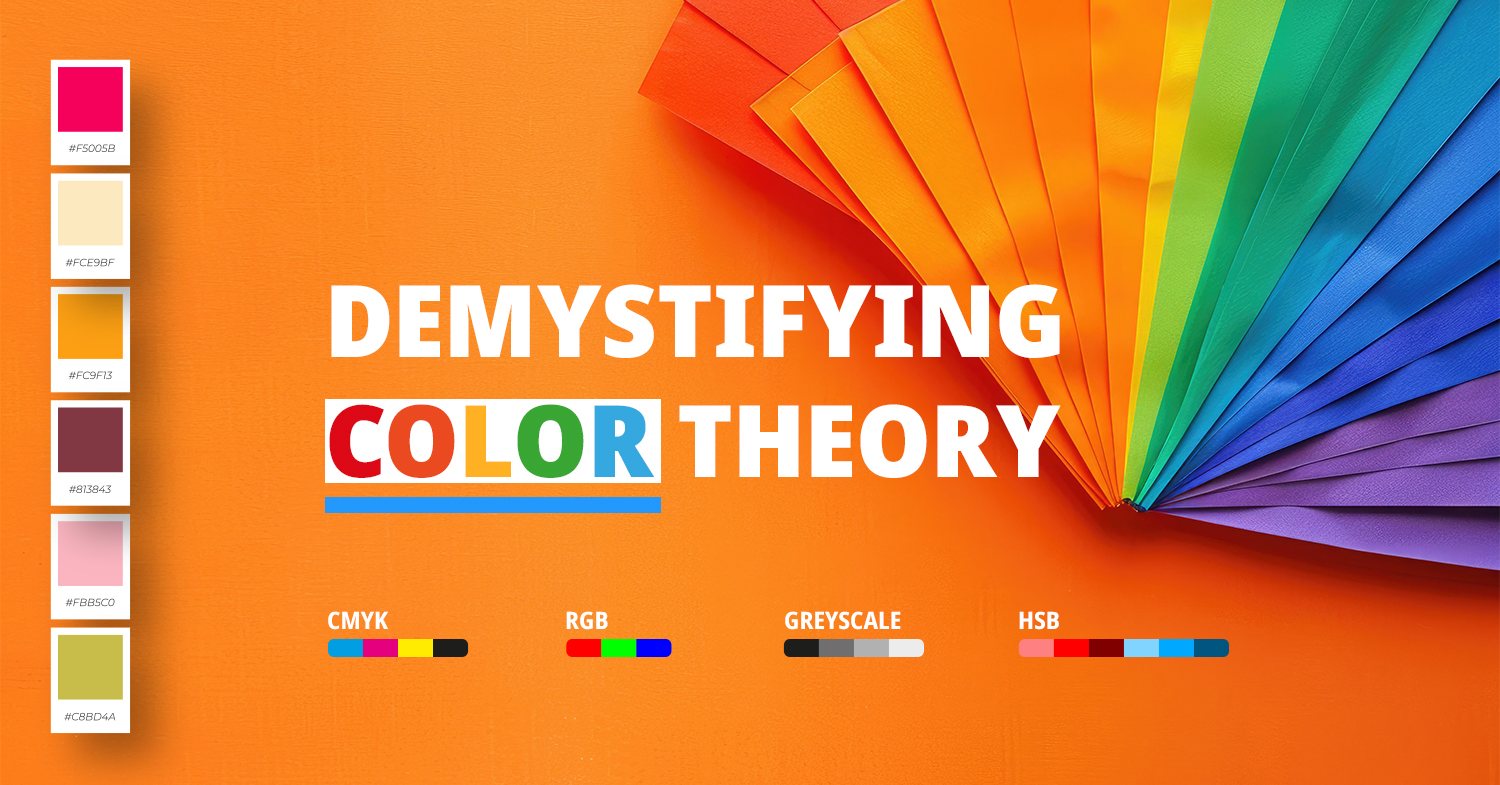
Understanding Color Theory
Color theory is the study of how colors interact and mix and the visual effects that color combinations create. It involves both the physics of light and the psychological responses that colors invoke in people. By mastering color theory, artists and designers can make informed choices that influence how a design or piece of art is perceived.
The concept of color theory goes back to the 17th century when Sir Isaac Newton developed the first color wheel. Newton's experiments with light and prisms laid the foundation for understanding the spectrum of colors. Later, other scientists and thinkers expanded on these ideas, eventually giving us the color models we use today.
Color theory plays a critical role in creating aesthetically pleasing designs, effective communication, and branding. In art and media, it helps evoke the intended emotions, ensuring harmony, contrast, and vibrancy where needed.
The Physics of Light and Color
To understand color, we need to understand light itself. The colors we see are the result of light interacting with different materials. In fact, color is simply a characteristic of light, and without light, color does not exist. Light behaves as both a particle and a wave, and its different wavelengths determine the colors we perceive. By grasping how light functions, we can better appreciate the principles of color theory and how colors interact with each other in different environments.
Wavelengths and the Electromagnetic Spectrum
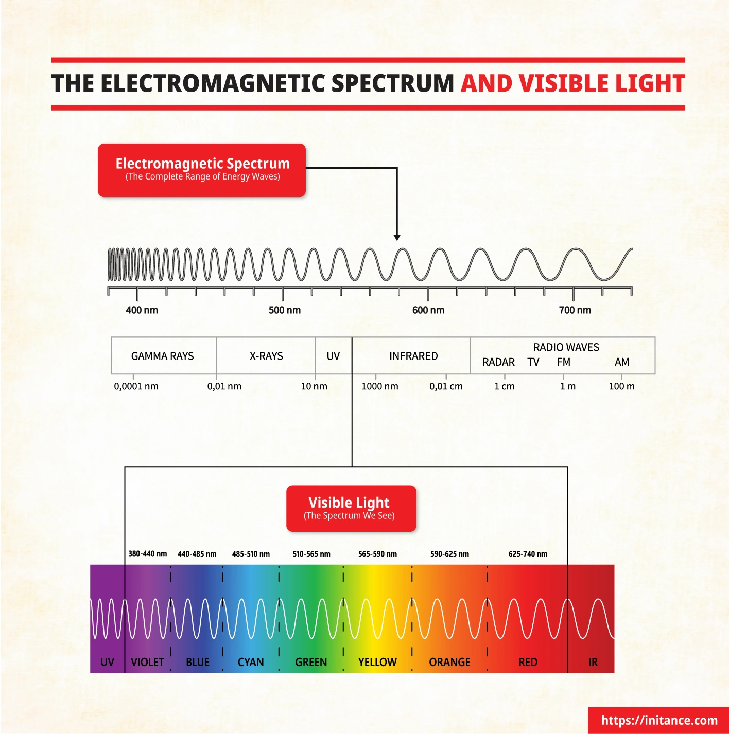
Before we dive deeper into understanding light, it's essential to know that all light is part of the electromagnetic spectrum, and light waves vary in length, known as wavelengths. These variations in wavelength determine the colors we see as well as other forms of radiation that are beyond our visible range. Now, let's explore the nature of light and its relationship to color.
Nature of Light
Light is electromagnetic radiation that travels in waves. These waves are characterized by their wavelengths — the distance between successive peaks — which play a key role in determining the type of light, including its color. Light waves vary in wavelength, and it is these variations that allow us to perceive a range of colors.
Visible Spectrum
The visible spectrum refers to the portion of the electromagnetic spectrum that humans can see, ranging from approximately 380 nm (nanometers) to 750 nm. This range includes all the colors we know, from violet (which has the shortest wavelength) to red (which has the longest wavelength).
Color and Wavelengths
Each color corresponds to a specific wavelength range (approximate values*) :
| Violet | ~380–450 nm |
|---|---|
| Blue | ~450–495 nm |
| Green | ~495–570 nm |
| Yellow | ~570–590 nm |
| Orange | ~590–620 nm |
| Red | ~620–750 nm |
Beyond the visible spectrum are ultraviolet (shorter wavelengths than violet) and infrared (longer wavelengths than red) lights, which are not visible to the human eye but have practical uses in technology and nature.
How the Human Eye Perceives Color
Biological Foundations of Color Theory
Our ability to perceive color begins with the sophisticated structure of our eyes, which work much like a high-performance camera. The eye collects light, focuses it, and converts it into signals that our brain processes into meaningful images. To truly understand color perception, it helps to dive into both the anatomy of the eye and the biological processes that allow us to see and interpret colors.
Anatomy of the Eye
- Cornea and Lens: The cornea and lens work together to focus incoming light onto the retina, which is located at the back of the eye. The cornea handles the initial bending of light, while the lens fine-tunes this focus.
- Retina and Photoreceptors: The retina contains specialized cells called photoreceptors — primarily rodsand cones — that react to light. These cells are essential for converting light into electrical signals that are sent to the brain.
Photoreceptors: Rods and Cones
Rods: Rods are highly sensitive to changes in light intensity, which makes them especially important for night vision and seeing in low-light environments. However, they do not detect color; rods are primarily responsible for detecting shades of gray.
Cones: Cones are responsible for color vision and function best in well-lit environments. There are three types of cones, each sensitive to different wavelengths:
- S-cones: Sensitive to short wavelengths (blue).
- M-cones: Sensitive to medium wavelengths (green).
- L-cones: Sensitive to long wavelengths (red).
Trichromatic Vision and Color Perception
The interaction of signals from these three types of cones gives us trichromatic vision — the ability to perceive a broad spectrum of colors. When light hits the cones, they convert this information into electrical signals, which are then transmitted to the brain through the optic nerve. The visual cortex in the brain processes these signals, allowing us to perceive a wide range of colors.
- Phototransduction: This is the process by which photoreceptors convert incoming light into electrical signals, a crucial step in visual perception.
- Signal Transmission: Once converted, the signals pass through bipolar cells and ganglion cells, eventually reaching the brain via the optic nerve.
- Visual Cortex Interpretation: The visual cortex is responsible for interpreting these signals, allowing us to understand and differentiate between colors in our surroundings.
Color Deficiencies and Limitations
Color Blindness: Not everyone perceives color in the same way. Some individuals have anomalies in their cone cells, leading to color vision deficiencies, commonly known as color blindness. There are a few types:
- Protanopia: Difficulty perceiving reds.
- Deuteranopia: Difficulty perceiving greens.
- Tritanopia: Difficulty perceiving blues.
Understanding these deficiencies is important for ensuring that designs are inclusive and accessible to all audiences.
Color Constancy and Adaptation
Color Constancy: Our brains have a remarkable ability to maintain color constancy, allowing us to perceive colors consistently under varying lighting conditions. This mechanism helps us recognize colors despite changes in lighting.
Chromatic Adaptation: Our visual system adjusts to changes in illumination through chromatic adaptation, ensuring that the colors we perceive remain consistent despite environmental variations. This adaptation is particularly important for designers who work across multiple mediums, as they need to account for differences in how colors are seen under different lighting conditions.
Color Gamut
Humans can perceive a vast range of colors—much wider than many devices are capable of displaying. This discrepancy between human color perception and device color reproduction can create challenges when trying to reproduce colors accurately across different media.
Metamerism
Metamerism is a phenomenon where two different color spectra appear identical to the human eye, making it challenging to achieve accurate color matching across various settings. For example, two fabrics dyed with different chemical compositions may look the same under natural light but appear different under artificial lighting.
Understanding the biological limitations and capabilities of human vision is essential for creating designs that resonate with all viewers. Factors such as color constancy, chromatic adaptation, and the differences in color gamut between the human eye and devices must be considered to create universally effective and appealing color choices.
Color Models and Systems
Color is not just about perception; it's about how we reproduce it, whether on screens or paper. To understand how colors are created and used in different mediums, we turn to different color models. The two primary models that form the foundation of color reproduction are the RGB(Additive Model) and CMYK (Subtractive Model). Additionally, the Pantone Color System is a standardized color-matching system that ensures consistent color reproduction across various materials and devices.
Additive Color Model (RGB)
The RGB model is the foundation for how we create color on digital screens. RGB is an additive color model, meaning that colors are created by adding light. This model uses three primary colors — Red, Green, and Blue — which, when combined in various intensities, can create millions of different colors.
When red, green, and blue light are mixed at full intensity, they produce white light. Conversely, when there is no light at all, we see black. By adjusting the amount of each color, we get every possible hue, from soft pastels to deep, vibrant shades.
The RGB model is used extensively in digital devices — everything from computer monitors to television screens relies on it. Since screens emit light, RGB is ideal for creating bright and vivid colors that stand out.
Subtractive Color Model (CMYK)
While RGB is perfect for the digital world, printing requires a different approach: the CMYK model. Unlike RGB, which uses light, the CMYK model works by subtracting light using physical pigments or inks—specifically Cyan, Magenta, Yellow, and Black (often referred to as the key color). This subtractive process works by absorbing certain wavelengths of light while reflecting others.
When cyan, magenta, and yellow are mixed, they create a color close to black, but not quite pure. To add depth and true contrast, black ink is used, especially for text and shadows, where clarity and sharpness are crucial.
The CMYK model is essential for physical printing — from magazines and brochures to posters. Unlike screens, which emit light, printed materials rely on reflected ambient light, and the subtractive CMYK model ensures that colors appear vibrant on paper.
Pantone Color System
To maintain consistency in color across different media and industries, the Pantone Color System comes into play. Pantone offers a standardized palette of colors, each identified by a unique code, which allows designers and printers to ensure that the color output remains consistent regardless of the device or material used.
This system is especially important in branding, where the precise reproduction of a specific color is crucial for maintaining a consistent visual identity. Whether a color appears on a product, a billboard, or a business card, Pantone provides the means to achieve exact matches without discrepancies
Properties of Color
Color is more than just a visual experience; it’s about understanding the different properties that define it, such as Hue, Saturation, and Value. Additionally, understanding color temperature helps us use colors effectively to evoke emotions and create an atmosphere.
Hue, Saturation, and Value (HSV Model)
The HSV model helps us break down color into three main components: Hue, Saturation, and Value, making it easier for designers to manipulate colors for the desired effect.
- Hue: Hue represents the type of color — whether it’s red, blue, green, or any other point along the color spectrum. It’s what we usually refer to when discussing color in general terms.
- Saturation: Saturation refers to the intensity or purity of the color. A highly saturated color appears bright and vivid, while a desaturated color appears more muted or closer to gray. By adjusting saturation, designers can determine how vibrant or subtle a color should be, which directly impacts a design's visual appeal.
- Value (Brightness): Value, also known as brightness, indicates how light or dark a color is. Adjusting the value helps create depth and contrast, allowing specific areas of a design to stand out or fade into the background.
The HSV model is especially popular in design software because it allows users to easily select and adjust colors by manipulating these three elements, helping them create harmonious and aesthetically pleasing designs.
Color Temperature
Colors can also be classified based on their temperature, which describes whether a color feels warm or cool. This temperature is a key aspect of how we emotionally perceive a space or image.
Warm vs. Cool Colors
Warm colors — such as reds, oranges, and yellows — are often associated with energy, passion, and warmth. They evoke feelings similar to being near fire or in sunlight. On the other hand, cool colors — like blues, greens, and purples — tend to evoke feelings of calmness, serenity, and relaxation, much like being near water or in a shaded area.
The temperature of light is measured using the Kelvin (K) scale. Lower temperatures, around 2000K to 3000K, produce warm colors similar to candlelight or sunset, while higher temperatures, around 5000K to 6500K, produce cooler, bluish light like that seen on a bright sunny day.
Color temperature can have a significant impact on the overall mood of a design. Warm colors often create an atmosphere of excitement and coziness, while cool colors bring a sense of calm and professionalism. Designers use color temperature to control how comfortable and emotionally engaging a visual composition feels to the audience.
Color Harmony and Schemes
Colors rarely exist in isolation; the beauty of design often lies in how colors interact and enhance one another. This is where color harmony comes into play — using combinations of colors that work well together to create visually appealing, balanced designs. Understanding different color schemes is essential for anyone looking to make impactful designs, whether in art, marketing, or branding.
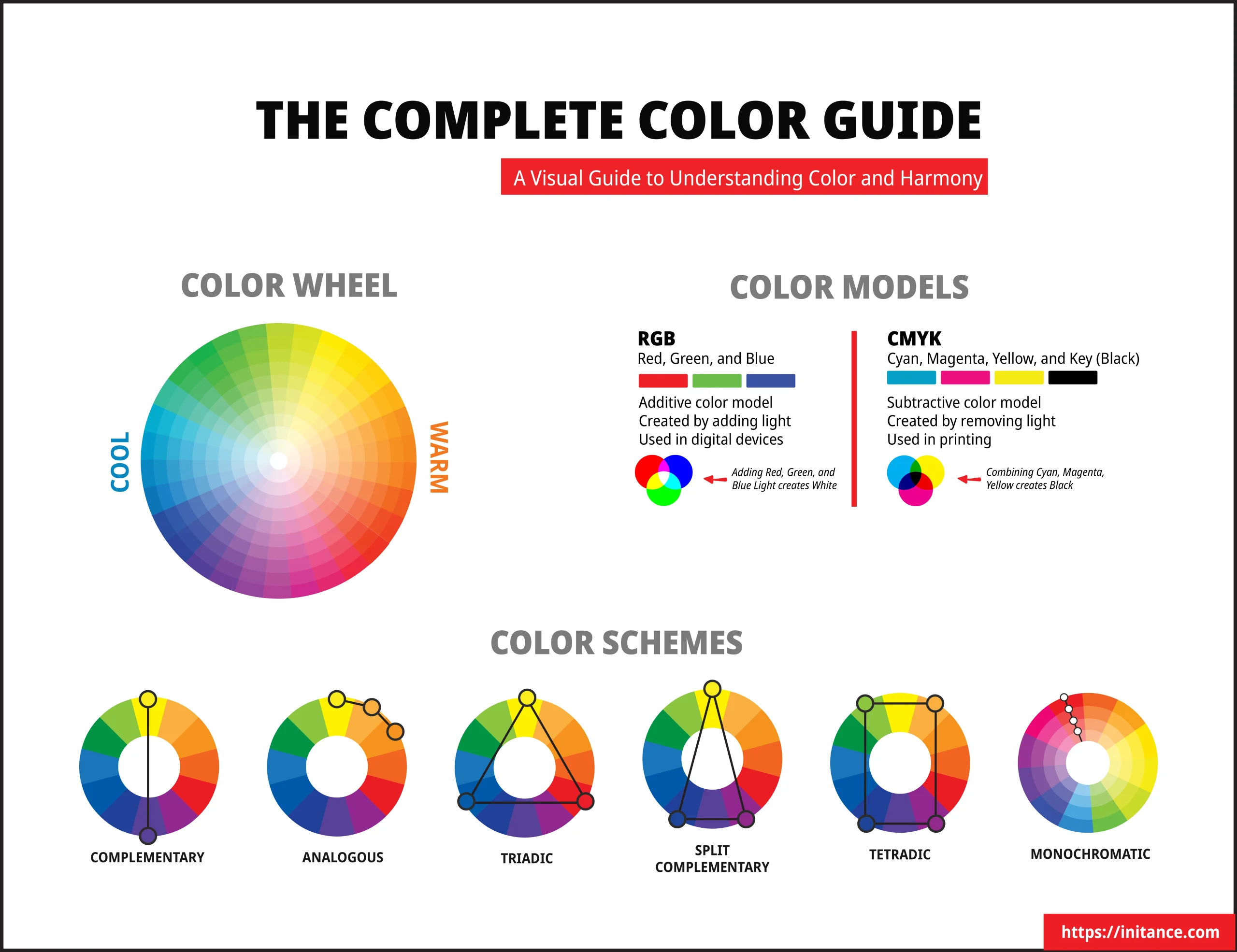
- Complementary Colors: These are colors that sit directly opposite each other on the color wheel. Pairing complementary colors creates vibrant contrasts that make each color pop, which is great for catching attention. Think of the classic blue and orange combination, which is often used in movie posters for its dramatic effect.
- Analogous Colors: Analogous colors are those that are next to each other on the color wheel. This kind of scheme provides a harmonious and cohesive look, often found in nature—like the soft transition of greens, yellows, and blues. It’s ideal for creating designs that feel natural and serene.
- Triadic Colors: Triadic schemes use three colors evenly spaced around the color wheel, such as red, yellow, and blue. This creates a balanced look with plenty of contrast but without the intensity of complementary colors. Triadic schemes are often used when you want vibrancy and diversity while maintaining harmony.
Advanced Color Schemes
For those looking for more complexity in their designs, advanced color schemes offer additional ways to bring out nuance and depth.
- Split-Complementary: The split-complementary scheme involves choosing a base color and then pairing it with the two colors adjacent to its complementary color. This scheme offers a dynamic contrast but with a bit more subtlety than a standard complementary scheme, making it versatile for designs that need a balance of energy and harmony.
- Tetradic (Double Complementary): The tetradic scheme uses two sets of complementary colors. This combination provides a rich and vibrant palette but requires careful use to maintain visual balance. It’s excellent for designs that need to be lively and diverse but can easily become overwhelming if not balanced well.
- Monochromatic: Monochromatic schemes use variations in the lightness and saturation of a single hue. This results in a subtle and unified appearance that feels sophisticated and cohesive. It’s perfect for creating an elegant, toned-down look, such as in branding, where consistency is key.
Choosing the right color harmony can significantly impact how appealing and balanced a design feels. Complementary colors might be ideal for call-to-action buttons or promotional banners that need to grab attention, while analogous colors work well for backgrounds that should feel seamless and cohesive. The key lies in understanding the emotional response each combination elicits and using these combinations to achieve the desired effect.
Technical Applications of Color Theory
When it comes to design, understanding color theory isn’t just about choosing the right hues — it also involves managing how these colors appear across different devices and mediums. This consistency is crucial for maintaining the impact of your designs, whether viewed on a screen or in print.
Color Calibration and Management
Color calibration ensures that the colors you see on your monitor match what will be printed or viewed on another device. This process is essential for effective visual communication and brand consistency, especially when your projects need to transition seamlessly between digital and physical forms.
Color profiles help maintain this consistency:
- sRGB is the standard color profile for most digital devices, widely used across websites and social media due to its broad compatibility.
- Adobe RGB covers a wider gamut than sRGB, especially useful for professional photography and print, allowing for more detailed color representation.
- ProPhoto RGB offers an even larger range of colors, making it ideal for high-end photo editing where precision is key.
To ensure that colors remain consistent across different devices, designers use calibration tools — hardware and software that align your monitor’s colors with the final printed or displayed output. Consistent calibration prevents discrepancies between what’s seen on a screen and what’s produced, minimizing surprises in the final outcome.
Color Conversion and Gamut
Working across different devices means grappling with color conversion, particularly when translating designs from digital screens (RGB) to print (CMYK). The differences between these color spaces can pose challenges for designers.
A color gamut is the range of colors that a device or medium can represent. The RGB gamut, used in digital screens, is larger than the CMYK gamut, which is used for printing. This disparity means that some colors visible on-screen cannot be accurately reproduced in print, leading to muted or altered hues.
Color conversion challenges arise when bright, vibrant colors in the RGB model fall outside the capabilities of the CMYK gamut. As a result, these colors might appear less vivid in print than they do digitally.
To address this, designers often use soft proofing — a technique that simulates print output on the screen to predict how the colors will look once printed. Additionally, working within the CMYK color space when designing for print can help minimize discrepancies and better align expectations.
Hexadecimal Codes in Digital Design
In digital design, hexadecimal or hex codes — are a standard way of representing RGB values in a format that computers can easily interpret.
A hex code is a six-digit combination used to precisely define colors in web design. This is particularly important for ensuring consistent color representation across different devices and browsers. For example, the code #FFFFFF represents white, while #000000 represents black. By using these codes in HTML, CSS, and other web technologies, designers can ensure that their chosen colors appear consistently, providing a unified visual experience.
Practical Tips for Using Color Theory in Design
To make the most out of color theory, it's important to not only understand how colors work but also how to effectively apply them in your designs. Here are some practical tips for using color theory to create impactful, consistent, and accessible visuals.
Choosing the Right Color Model
Selecting the appropriate color model depends largely on the medium you are designing for.
RGB color model: For digital designs, the RGB color model is the go-to choice, as it uses red, green, and blue light to create colors, making it perfect for anything that will be viewed on a screen, such as websites, apps, or digital advertisements.
CMYK color model: For print projects, the CMYK color model should be used. This model produces colors using cyan, magenta, yellow, and black inks. Understanding the limitations of CMYK and designing with this color model from the start can help avoid issues when your work moves from screen to print.
Pantone color system: For projects that require precise color reproduction — especially for branding — working with the Pantone color system is key. Pantone provides a standardized color matching system, ensuring that colors remain consistent no matter where or how they are reproduced, making it particularly useful for physical media like branded merchandise or packaging.
Effective Color Combinations
Using the right color combinations can significantly enhance the appeal of your designs. To ensure the best visual impact, apply color harmonies thoughtfully and consider accessibility and readability.
Applying Color Harmonies is one of the best ways to create an aesthetically pleasing design. Using the color wheel, you can select complementary, analogous, or triadic schemes that evoke the desired emotional response while maintaining a balanced look.
Contrast and Readability are crucial elements in any design, especially when it comes to text. Ensuring that there is enough contrast between the text and the background not only enhances readability but also makes the message stand out. For instance, dark text on a light background or vice versa provides sufficient contrast, improving the user's ability to engage with the content comfortably.
Accessibility is another important consideration. Around 8% of men and 0.5% of women have some form of color vision deficiency, meaning that they might not perceive colors the way the average viewer does. When designing, use high-contrast color combinations and add redundant cues like text labels or symbols to ensure that your content is accessible to all users. This approach not only broadens your audience but also makes your design more inclusive.
Conclusion
Throughout this exploration of color theory, we've seen how understanding the scientific principles behind color can enhance creative endeavors. By bridging the gap between the scientific and artistic aspects of color, designers gain better control over how their work is perceived, enabling more impactful visual storytelling.
Color theory is not just about technical accuracy; it's about using this technical knowledge to boost creativity. By understanding how colors mix, interact, and influence emotions, designers, and artists can more effectively evoke the intended emotional responses from their audiences.
The world of color theory is ever-evolving, particularly with the constant advancements in technology and design tools. Staying updated and continuously learning about new trends, technologies, and theories will help you push the boundaries of your work, making it even more engaging and impactful.
If you're curious about the emotional impact of colors and want to understand how they impact human emotions, we encourage you to explore our The Psychology of Color - How Colors Influence Emotion and Behavior blog, where we dive into the fascinating interplay between color and the human psyche and learn how colors can be used to influence behavior and create deeper connections with your audience.