Typography is more than just letters on a page. It's the silent partner in every piece of branding, conveying your business's personality, values, and aspirations without uttering a single word. In a world overflowing with visual stimuli, the right font can be the difference between a forgettable impression and a lasting connection.
This blog is crafted to help you understand the art and science of typography — its classifications, anatomy, emotional undertones, and its critical role in branding. By the end of this guide, you'll not only appreciate the thoughtfulness behind typeface selection but also feel equipped to make choices that amplify your brand's voice.
Understanding the Basics
Difference between Fonts and Typefaces
Understanding the difference between a typeface and a font is crucial for making informed design decisions and effectively communicating your brand's visual identity. This distinction ensures your design choices are consistent and intentional and creates a cohesive brand presentation.
What is a Typeface?
A typeface is a set of characters—letters, numbers, and symbols—that share a common design. It serves as the visual identity or family of a group of characters, such as Helvetica.
What is a Font?
A font is a particular variation within a typeface, defined by its style, weight, and size. For example, Helvetica Bold Italic at 12pt is a specific font within the Helvetica typeface.
In everyday usage, especially in digital contexts, the terms "typeface" and "font" are often used interchangeably. However, understanding the technical distinction can enhance clarity, particularly in professional and design discussions.
Now that we understand the fundamental difference between a typeface and a font, let's explore the deeper aspects of typography that bring these elements to life.
The Anatomy of Typography
Typography isn't just about selecting a "nice" font. It's about understanding how each part of a letter contributes to its overall appearance, readability, and emotional impact. Knowing these typographic components helps you choose the right fonts for your brand and use them effectively.
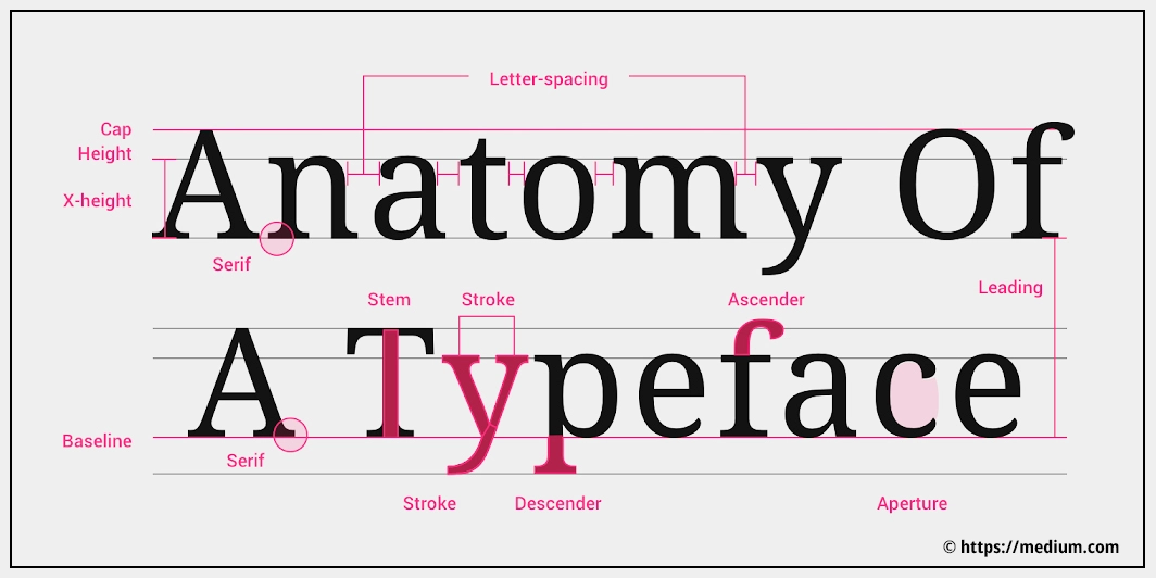
Key Anatomical Terms and Their Significance
| Baseline | The line on which most letters sit. This provides a consistent visual structure for letters across a typeface. |
|---|---|
| Cap Height | The height of uppercase letters from the baseline. This affects how large or dominant capital letters appear in your text. |
| X-Height | The height of lowercase letters, specifically the letter "x." The x-height is a key determinant of legibility—larger x-heights typically improve readability, especially for smaller fonts. |
| Ascender | The upward stroke that extends above the x-height in lowercase letters, like in "b" or "d." Ascenders create a vertical rhythm and help distinguish letters, which aids readability. |
| Descender | The part of a lowercase letter that descends below the baseline, like in "p" or "g." Descenders also contribute to the rhythm and help balance the visual weight of the text. |
| Stroke | The main lines that form each part of a letter. Strokes can be straight, curved, or diagonal, adding to a typeface's character. |
| Serif | Small decorative strokes or lines added to the ends of a letter's main strokes, found in serif typefaces. Serifs are believed to improve the flow of reading, especially in print materials. |
| Stem | The main vertical or diagonal stroke of a letter, such as in "L" or "V." The stem is the central support structure for many letterforms. |
| Bar/Crossbar | The horizontal stroke in letters like "A" and "H." The crossbar serves to connect parts of a letterform and is an important visual feature. |
| Counter | The enclosed or partially enclosed space inside a letter, such as in "o," "e," or "b." Counters help distinguish letterforms and enhance readability. |
| Terminal | The end of a stroke that doesn't end in a serif, often seen as rounded, blunt, or pointed finishes in letters like "f" or "r." Terminals add character to a typeface and can influence its personality. |
| Aperture | The partially enclosed opening in letters like "c" or "n." Apertures affect the openness and readability of a typeface, influencing how the text is perceived. |
| Leading (Line Spacing) | The vertical distance between lines of text. Proper leading is crucial for readability, especially in longer passages of text — too tight and the lines feel cramped; too loose, and they look disconnected. |
| Kerning | The adjustment of space between specific pairs of characters to ensure consistent spacing and avoid awkward gaps. Kerning improves the visual flow, particularly important for large text like headlines or logos. |
| Tracking (Overall Character Spacing) | The uniform adjustment of space across a group of characters. Unlike kerning, which adjusts space between pairs of letters, tracking is applied consistently to an entire word or paragraph to achieve a desired visual density—either tighter for impact or more open for elegance. |
Understanding Stroke Contrast
Stroke contrast refers to the difference between the thick and thin parts of a letter. This characteristic plays a significant role in the overall personality of a typeface and its readability. High-stroke contrast can give a typeface an elegant and refined look, often appealing in luxury branding or headings. However, it may hinder readability at smaller sizes, making it less ideal for body text. On the other hand, low-stroke contrast provides a more uniform appearance, which enhances readability, especially in digital content or long-form printed materials, making it a practical choice for body text and user interfaces.
Exploring Typeface Classifications
Typeface classifications help designers and brands select fonts that align with their visual goals. Different typefaces communicate specific emotions and functionalities, and understanding these classifications allows for more deliberate and effective design choices that convey the intended brand message.
Serif Typefaces
Serif typefaces are characterized by small lines or decorative strokes at the ends of each letter's main strokes, conveying a sense of tradition and stability. Originating from Roman inscriptions and refined during the Renaissance, serif fonts have evolved into several subcategories:
- Old Style (Humanist): These typefaces have low contrast and diagonal stress, exemplified by fonts like Garamond. They evoke a classic, traditional feel.
- Transitional: Fonts like Baskerville show medium contrast with more vertical stress, representing a blend of tradition and modernity.
- Modern (Didone): Typefaces such as Bodoni are characterized by high contrast and thin, unbracketed serifs, lending an elegant and sophisticated appearance.
- Slab Serif: Thick, block-like serifs with minimal contrast, such as Rockwell, give these typefaces a bold and stable look.
Serif typefaces are best suited for printed materials such as books, where they help convey reliability and a sense of authority.
Examples: Times New Roman is widely used in academic writing, while Garamond is often found in novels due to its classic, readable appearance. Georgia is another common serif font frequently used for both web content and print because of its elegance and readability.
Sans-Serif Typefaces
Sans-serif typefaces are characterized by the lack of decorative serifs, featuring clean, modern lines that are often perceived as more contemporary. Emerging in the 19th century, sans-serif fonts focused on simplicity and readability, which makes them especially useful in modern design contexts. They are ideal for digital media and brands that want to convey a contemporary, approachable image.
- Grotesque: Slightly irregular shapes add character (e.g., Franklin Gothic).
- Neo-Grotesque: Refined and neutral typefaces like Helvetica offer a versatile, minimalist appearance.
- Humanist: Inspired by handwriting, fonts like Gill Sans have organic shapes that add warmth and personality.
- Geometric: Highly uniform and structured, fonts like Futura are based on geometric forms.
Sans-serif typefaces are among the most commonly used fonts in the world today, with popular brands like Google, Microsoft, and Spotify relying on them to convey simplicity, modernity, and approachability. Their clean and versatile design makes them a go-to choice for many digital and corporate identities.
Examples: Arial is a common default font on most computers, and Helvetica is used extensively in branding, making it one of the most versatile and easily recognizable sans-serif typefaces. Calibri, which served as the default font for Microsoft Word and PowerPoint for over a decade, is another widely used sans-serif typeface that is known for its modern and clean appearance.
Script Typefaces
Script typefaces mimic cursive handwriting or calligraphy, featuring flowing, connected strokes that add a sense of elegance and personality. They are most appropriate for formal branding, invitations, or logos where an intimate, creative, or luxurious touch is desired.
Examples: The Coca-Cola logo is a famous example of a script typeface, conveying friendliness and nostalgia. Lucida Handwriting is another script font commonly found in Microsoft Word, often used to give an elegant and personal touch to formal invitations. Brush Script is also widely used for invitations and event branding.
Monospaced Typefaces
Monospaced typefaces are characterized by their uniform spacing, where each character occupies the same horizontal space. Originally designed for typewriters, these fonts have a technical and retro appearance, making them ideal for coding, technical documents, or any material requiring precise alignment, such as tabular data.
Examples: Courier New is a well-known monospaced font, often used in programming environments for its easy-to-read, uniform spacing. Another example is Consolas, which is a default font in many code editors and is favored for its clarity and clean look.
Display and Decorative Typefaces
Display and decorative typefaces are crafted for visual impact, often highly stylized to grab attention. These fonts are not suitable for body text but are ideal for posters, logos, and advertising materials where making a bold statement is crucial.
Examples: Impact is a popular display typeface used in memes for its bold, eye-catching style. Cooper Black is another well-known example, often seen in retro designs, album covers, and advertising, conveying a playful yet strong presence. Lobster is also used frequently in decorative logos and signage.
Blackletter Typefaces
Blackletter typefaces, also known as Gothic, are characterized by dense, ornate lettering reminiscent of medieval manuscripts. They are effective for formal documents, certificates, and branding that aims to evoke a historical or traditional aesthetic.
Examples: Old English is a typical blackletter font seen in newspaper mastheads like The New York Times, evoking a sense of tradition and authority.
Symbol and Dingbat Typefaces
Symbol and Dingbat typefaces consist of icons, symbols, or decorative elements instead of standard alphanumeric characters. They are often used to enhance designs with visual elements such as bullet points, icons, or embellishments.
Examples: Wingdings and Webdings are common symbol typefaces, used to add visual elements like arrows or smiley faces in presentations and documents.
Font File Formats and Their Importance
While font file formats may not be the first thing that comes to mind when choosing a typeface for your brand or making design decisions, understanding these formats contributes to a more holistic view of typography. The technical details of how fonts are rendered across various platforms can influence aspects like compatibility, performance, and visual quality. Although these details may not directly impact your creative choices, they are "nice to know" pieces of information that enrich your comprehensive understanding of fonts and their applications.
Common Font File Formats
- TrueType (.ttf): Versatile and widely supported across platforms.
- OpenType (.otf): Supports advanced features like ligatures and alternate characters, offering more design flexibility.
- Web Open Font Format (.woff, .woff2): Optimized for web use, these formats are compressed for faster loading times.
- Variable Fonts (within .ttf and .otf): Utilizes advanced technology to include multiple styles (such as weight, width, or slant) within a single font file, enhancing flexibility and efficiency in design applications.
- Embedded OpenType (.eot): A legacy format primarily used in older browsers.
- Scalable Vector Graphics (.svg): Supports complex graphic elements and colors, ideal for web use where visual richness is key.
Choosing the Right Format
When selecting a font file format, consider the intended medium — whether print or digital—the required typographic features and your audience's devices and needs. Though this decision may not always rest with designers, having this knowledge ensures your typography looks as intended across all applications.
The Role of Variable Fonts
Variable fonts are a modern font technology that encapsulates multiple variations (such as weight, width, or slant) within a single font file. This allows for dynamic adjustments, providing greater flexibility and efficiency in design applications.
Making Informed Choices
Difference between Free and Commercial Fonts
Choosing the right fonts for your brand involves more than just aesthetics; it also requires understanding the legal aspects. Compliance with font licenses is crucial to avoid legal complications and to protect your brand’s reputation. The choice between free, commercial, and custom fonts depends on a range of factors, such as budget, uniqueness, quality, and brand identity. Each type comes with its own set of advantages and considerations, which we’ll explore to help you make an informed decision.
Free Fonts
Free fonts are a popular choice for many brands due to their cost-effectiveness and wide availability. These fonts are readily accessible, making them a practical option for businesses that are just starting out or have limited budgets. However, while free fonts offer convenience, there are also considerations that must be taken into account. Overuse of free fonts can make a brand feel generic or less unique, as these fonts are widely used across numerous projects and industries. Ensuring that a free font aligns with your brand’s personality and values is key to maintaining distinctiveness while saving on costs.
Commercial Fonts
Commercial fonts are designed to provide exclusivity and higher quality compared to free fonts. They often come with comprehensive character sets, advanced features, and professional support, which can significantly enhance the visual appeal of your brand. The investment in a commercial font can pay off in terms of creating a unique and consistent brand identity. However, licensing costs can vary significantly, and it's essential to ensure that the font's license covers all intended uses—whether in digital applications, print, or other media. Choosing a commercial font allows for more control over the aesthetic, supporting the brand's credibility and distinctiveness.
Custom Fonts
Custom fonts offer the ultimate exclusivity for brands that desire a truly distinctive visual identity. A custom font is explicitly designed for your brand, ensuring that no other business has the same typographic look and feel. The process involves commissioning a type designer, which does require a higher financial investment, but the result is a font that is uniquely yours and that perfectly embodies your brand’s personality. Custom fonts are an excellent option for brands looking to stand out and make a memorable impression.
Balancing Uniqueness and Practicality
When selecting a font, it's essential to strike a balance between uniqueness and practicality. The chosen fonts should be distinct enough to differentiate your brand from competitors but versatile enough to function well across various contexts, from digital media to print and signage. Assess your brand's needs and how the font will be used to ensure that it not only stands out but also remains practical and legible across all mediums.
Sources for Fonts
| Font Source | Website URL | Font Type |
|---|---|---|
| Google Fonts | https://fonts.google.com/ | Free Font |
| Font Squirrel | https://www.fontsquirrel.com/ | Free Font |
| DaFont | https://www.dafont.com/ | Free Font |
| Adobe Fonts | https://fonts.adobe.com/ | Commercial Font |
| MyFonts | https://www.myfonts.com/ | Commercial Font |
The Psychological Impact of Typefaces
Typography is far more than a visual design element; it’s a powerful psychological tool that can evoke emotions, influence perception, and communicate brand values without words. The choice of typeface has a subconscious impact on how audiences perceive your brand, contributing to the emotional tone and credibility of your message.
Psychological Associations of Typefaces
- Serif: Conveys tradition, reliability, and professionalism. Serif fonts are often used by financial institutions or academic brands to evoke a sense of authority and trustworthiness.
- Sans-Serif: Modern, clean, and accessible, making brands feel approachable. Popular in digital interfaces, sans-serif fonts are favored by tech companies like Google and Facebook for their clean and user-friendly aesthetics.
- Script: Suggests elegance, creativity, and intimacy. Script fonts are ideal for brands that want to communicate a personal touch, such as luxury goods or wedding services.
- Slab Serif: Communicates strength, boldness, and confidence. These fonts are often used by brands wanting to make a strong, impactful statement, such as in sports or outdoor equipment.
- Monospaced: Reflects technical precision and functionality. Monospaced fonts are common in coding environments and tech documentation, emphasizing clarity and simplicity.
- Blackletter: Implies heritage, formality, and seriousness. Blackletter fonts are used in contexts that require a sense of tradition or historical significance, like newspaper mastheads or ceremonial certificates.
- Display/Decorative: Expresses uniqueness and grabs attention. These fonts are suitable for headlines, posters, or any situation where the goal is to stand out and make a visual impact.
Choosing Typefaces Based on Emotional Impact
Selecting the right typeface is about more than aesthetics—it's about aligning your typography with your brand's core values to evoke the desired emotional response from your audience. A tech startup may opt for a sans-serif typeface to convey modernity and simplicity, emphasizing innovation and approachability. Conversely, a luxury brand may choose a script font to communicate elegance, sophistication, and a personal touch. Understanding the emotional associations of each typeface helps ensure that your brand is perceived in the way you intend, making typography a critical tool in brand storytelling.
Integrating Typography into Your Branding Strategy
Typography is a fundamental aspect of your brand's visual identity. Even before a single word is read, the typeface you choose communicates a wealth of information about your brand — its personality, tone, and values. Well-chosen typography can evoke emotions, set expectations, and create an immediate connection with your audience.
Establishing Brand Consistency
Consistency in typography is crucial for building brand recognition and establishing trust. Using the same fonts across all branding materials—both online and offline—ensures your brand remains recognizable and cohesive. It’s advisable to stick to 2-3 typefaces to create a unified look, applying them consistently across platforms such as your website, social media, printed materials, and advertising campaigns.
Selecting Typefaces for Your Brand
Selecting the right typefaces begins with assessing your brand personality. Define your brand attributes—whether it's "modern," "playful," "elegant," or "authoritative" — and choose fonts that visually represent these characteristics. Beyond personality, readability is key. The fonts you select must be easily readable across all platforms, including print, digital, and physical signage. Versatile typefaces that retain their legibility in varying sizes and formats help maintain consistency and accessibility.
Hierarchy and Pairing
A strong typographic hierarchy is essential for guiding the reader’s attention and delivering your message effectively. This involves using variations in size, weight, and style to indicate the importance of different elements, such as headings, subheadings, and body text. Additionally, thoughtful font pairing is crucial. Choosing fonts that complement each other creates contrast and balance. A common approach is pairing a serif font for headings with a sans-serif font for body text to achieve a visually appealing and balanced presentation.
Practical Application Across Platforms
Typography should be versatile enough to maintain its effectiveness and appeal across different platforms. Whether it’s a printed brochure, a digital interface, or environmental branding like signage, your typefaces need to translate seamlessly. Testing fonts in various mediums ensures that they maintain their appearance, legibility, and impact, no matter where they are used.
Accessibility Considerations
To be truly effective, typography must be inclusive. Select fonts that adhere to Web Content Accessibility Guidelines (WCAG) to ensure readability for everyone, including people with visual impairments or reading disabilities. Choosing accessible typefaces and ensuring proper contrast and legibility can significantly enhance the user experience for all audiences.
Maintaining Flexibility
Typography should be adaptable to the changing needs of your brand and the platforms it uses. Variable fonts are a smart choice in this regard — they offer scalability and flexibility, making them perfect for responsive web designs and other dynamic applications. This adaptability ensures your brand remains visually consistent across evolving digital environments.
Documenting Your Typography Guidelines
Creating a typography style guide is essential for maintaining consistency. A style guide provides detailed instructions on font usage — including typeface choices, sizes, spacing, and specific use cases — which helps all team members and external partners apply your typography consistently across all brand communications. This ensures that your brand’s visual identity is cohesive and recognizable.
Conclusion
Typography is more than just a visual element; it’s an unspoken language that conveys your brand’s identity. By understanding the anatomy of typefaces, their classifications, and their psychological impact, you can make informed font choices that empower your brand to forge a deeper connection with your audience. Thoughtful typography is not just about aesthetics; it’s a strategic asset that shapes brand perception, sets the tone, and ensures your message resonates effectively.
Explore different typefaces, experiment with combinations, and elevate your designs. Don’t be afraid to let your typography tell a story that is uniquely yours. The right font choices can help your brand stand out, foster recognition, and create a lasting emotional connection.