A logo is more than just an image—it’s the spark that ignites recognition, trust, and curiosity. Picture it as the silent storyteller that speaks volumes about a brand at just a glance. Whether it’s the golden arches of McDonald’s or the Apple with a bite taken out, logos have a way of leaving an imprint on our minds.
But what makes a logo more than just a pretty picture? How do certain logos resonate so deeply while others fade into the background? This blog delves into the fascinating world of logo design, exploring different types, their role in branding, and the art and science behind their creation. By the end, you’ll see logos not just as designs but as powerful symbols with the ability to connect, inspire, and endure.
What is a Logo?
A logo is a brand’s visual ambassador, encapsulating its identity, values, and mission in a single glance. Often, the first thing people notice about a business, it plays a vital role in shaping that all-important first impression. Whether bold and daring, sleek and modern, or classic and timeless, a logo instantly communicates what a brand stands for and promises to deliver.
Far from being just a decorative element, a logo is the face of a brand, creating familiarity and forging emotional connections. Over time, a well-crafted logo builds credibility and transforms into a symbol of trust and reliability, bridging the gap between recognition and loyalty. It’s not just a design — it’s the heart of a brand’s identity.
The Importance of Logos in Branding
A logo is a cornerstone of a brand’s identity, shaping how it is perceived and helping build meaningful connections with its audience. At its core, a logo captures a brand’s essence, acting as a visual shorthand for everything it represents. For instance, Nike’s iconic swoosh isn’t merely a checkmark—it’s a symbol of movement, ambition, and empowerment, perfectly aligning with the brand’s identity.
Logos also harnesses the power of human psychology, using colors, shapes, and typography to evoke emotions and associations. Coca-Cola’s vibrant red conveys energy and joy, while Google’s playful palette sparks curiosity and creativity. These carefully chosen design elements create emotional bonds with the audience, ensuring the logo resonates on a deeper level.
Beyond its visual appeal, a logo evolves into a symbol of credibility and loyalty. It becomes a trusted emblem that audiences recognize, connect with, and remember.
Key Elements of Effective Logo Design
Great logos aren’t stumbled upon by chance — they’re thoughtfully crafted to balance simplicity, meaning, and adaptability. A clean, uncomplicated design not only grabs attention but ensures the logo works seamlessly across platforms, whether it’s displayed on a smartphone screen or a towering billboard.
The true power of a logo lies in its ability to connect deeply with its audience, and this connection is guided by several key psychological principles:
- Attention: A logo must immediately stand out in a crowded visual landscape, capturing the viewer's focus.
- Perception: The design should align with how the audience interprets visual cues, ensuring clarity and relevance.
- Meaning: Each element of the logo conveys aspects of the brand's essence, telling a story that resonates with the audience.
- Emotional Response: By evoking feelings such as trust, excitement, or comfort, the logo fosters an immediate emotional connection.
- Memory: A memorable logo stays embedded in the audience's mind; simplicity and uniqueness enhance recall and recognition.
The core components of a logo — shapes, colors, and typography — play a vital role in creating this connection. Shapes carry psychological weight: circles evoke unity and inclusivity, triangles symbolize strength and growth, and curves create a sense of warmth and approachability. Colors add emotional depth, with blue fostering trust, red sparking passion, and green symbolizing growth and renewal. Typography completes the picture, with serif fonts exuding authority and tradition, while sans-serif fonts feel modern and approachable.
By harmonizing these elements and principles, a logo becomes more than just a design — it transforms into a powerful symbol that represents a brand’s identity, leaving a lasting impression and building a meaningful connection with its audience.
Types of Logos
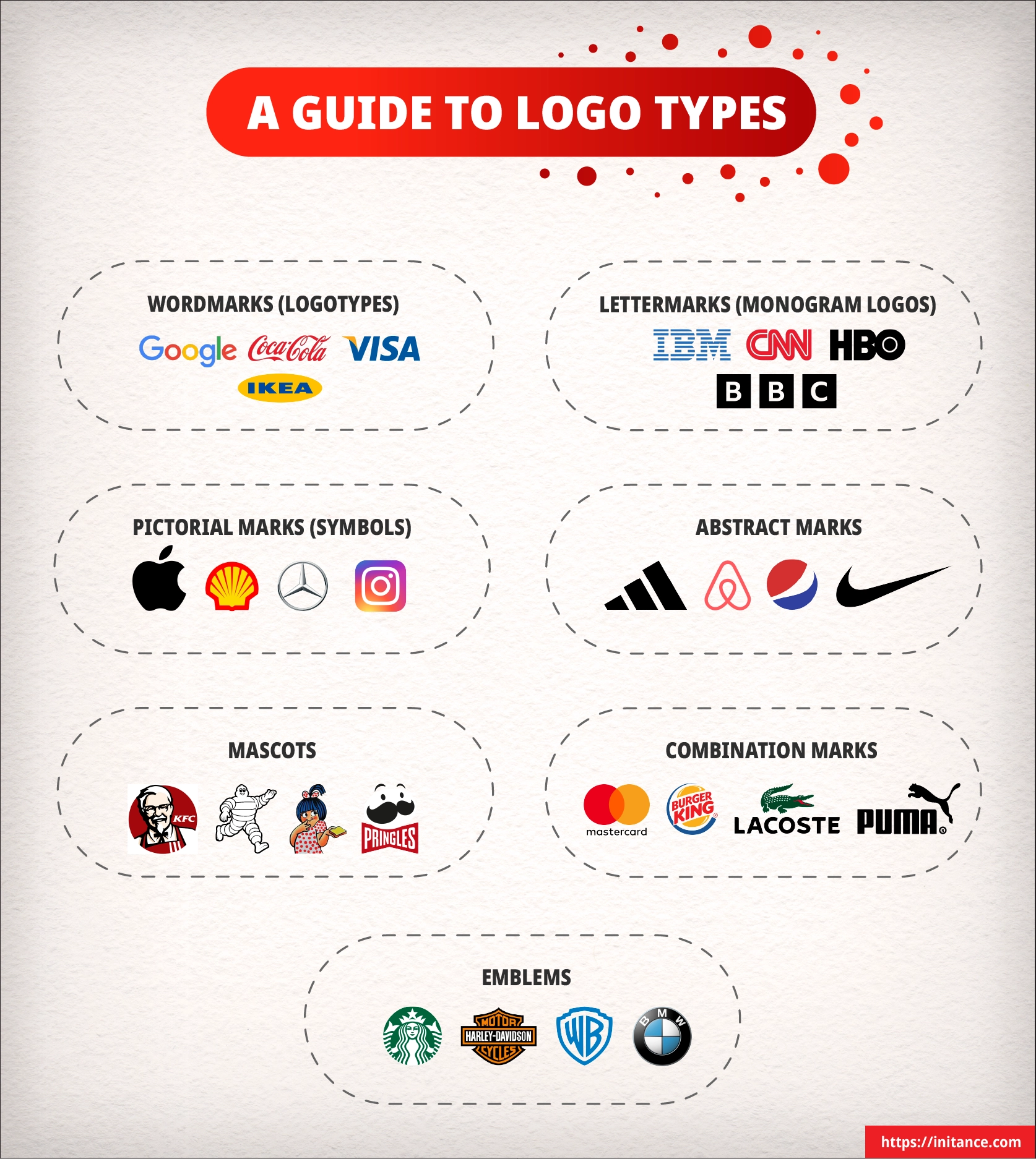
Logos come in various forms, each designed to communicate a brand's identity in a unique way. From simple text-based designs to intricate symbols, the type of logo chosen often reflects the brand's purpose, personality, and target audience. While some logos rely on clean typography to make an impact, others use symbols or combinations of elements to evoke deeper associations and versatility.
Each type of logo has its own strengths and is suited for specific purposes. A brand with a distinctive name might use a wordmark to reinforce recognition, while one seeking a strong visual presence might opt for a pictorial or abstract mark. Understanding these different types is essential in selecting a logo that not only aligns with a brand's identity but also resonates with its audience.
Here are the seven universally recognized types of logos
Wordmarks (Logotypes)
These logos focus on typography, presenting the brand name in a unique, stylized font. They are ideal for brands with distinctive, memorable names that want to highlight their identity through text.
Examples: Google, Coca-Cola, Visa
Lettermarks (Monogram Logos)
Lettermarks simplify lengthy or complex brand names into initials or abbreviations, creating a sleek, recognizable identity. This type of logo works well for businesses commonly referred to by their initials.
Examples: IBM, CNN, HBO
Pictorial Marks (Brand Marks or Symbols)
These logos use standalone graphic icons or images to represent the brand visually. They are effective for established brands with strong visual recognition.
Examples: Apple, Shell, Mercedes
Abstract Marks
Abstract marks rely on geometric shapes or unconventional designs to symbolize the brand. They are often used to convey unique concepts or values
Examples: Nike’s swoosh, Airbnb, Adidas’ trefoil.
Mascots
Mascot logos feature illustrated characters or personas that embody the brand’s identity. They are great for creating a friendly, approachable image, especially for family-focused brands.
Examples: KFC’s Colonel Sanders, Michelin Man, Amul Butter Girl
Combination Marks
These logos blend text and symbols to create a versatile design that can be used together or independently. Combination marks are ideal for brands that require flexibility across different platforms.
Examples: Burger King, Mastercard, Lacoste
Emblems
Emblems combine text and symbols within a single, inseparable design, often resembling badges or crests. They are commonly used by institutions, organizations, and legacy brands to convey tradition and authority.
Examples: Harley-Davidson, Starbucks, Warner Bros
Beyond selecting the type of logo, the arrangement of its elements — known as Logo Lockup — is crucial for maintaining consistency and enhancing recognition. A logo lockup defines how the text and symbol are positioned relative to each other, ensuring the logo remains cohesive across different applications. For instance, a combination mark like Adidas must maintain a specific spatial relationship between its text and the iconic stripes to preserve brand integrity. Consistent logo lockups help reinforce brand identity, making the logo instantly recognizable and adaptable to various branding materials.
Logo Design Styles
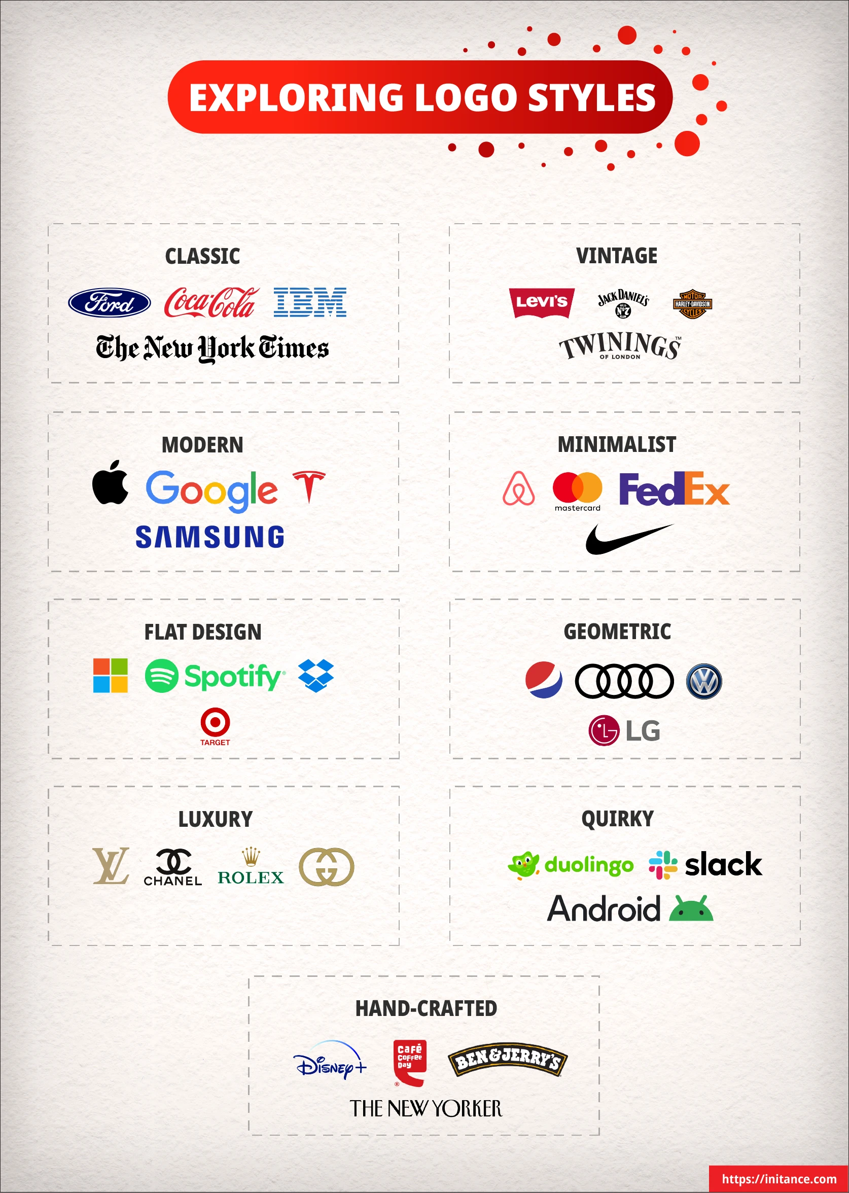
A logo’s style sets the tone for how it’s perceived, shaping the emotional response of the audience and reflecting the brand’s identity. Choosing the right style helps ensure the logo resonates deeply with the target audience while aligning with the brand’s values.
Here are some of the most popular logo design styles.
Classic
Classic logos rely on timeless, balanced designs that avoid trends and stand the test of time. Featuring simple layouts and traditional typography, they convey a sense of trust and reliability, making them ideal for brands with a long-standing presence.
Examples: Coca-Cola, Ford
Vintage
Vintage designs evoke nostalgia using retro typography, ornate details, and aged textures. These logos create a sense of heritage and authenticity, appealing to audiences who value tradition and familiarity.
Examples: Levi’s, Jack Daniel’s
Modern
Sleek and minimalist, modern logos use clean lines, negative space, and simple forms to convey innovation and sophistication. This style suits brands that want to project a forward-thinking and contemporary image.
Examples: Apple, Google
Minimalist
Minimalist logos focus on essential elements, removing unnecessary details to create clarity and elegance. With their clean aesthetic and versatile designs, they are perfect for brands seeking simplicity and focus.
Examples: Nike, Airbnb
Flat Design
Flat design eliminates textures, gradients, and shadows, creating two-dimensional logos that are highly scalable and adaptable. Known for their clarity and usability, flat designs are often chosen for digital-first brands.
Examples: Microsoft, Spotify
Geometric
Geometric logos use structured patterns and shapes to create precise and orderly designs. This style conveys stability and professionalism, making it ideal for brands seeking to communicate strength and reliability.
Examples: Adidas, Mitsubishi
Luxury
Luxury logos feature sophisticated fonts, intricate details, and premium colors such as gold or black. They exude exclusivity and prestige, making them perfect for high-end brands looking to attract an upscale audience.
Examples: Chanel, Rolex
Quirky
Quirky logos embrace playful, unconventional elements like whimsical fonts, vibrant colors, or unexpected graphics. This style appeals to brands wanting to be approachable, fun, and memorable.
Examples: Duolingo, Slack
Hand-Crafted
Hand-crafted logos emphasize an artisanal feel through hand-drawn elements or custom typography. They create a sense of authenticity and warmth, making them suitable for brands focused on craftsmanship and uniqueness.
Examples: Cafe Coffee Day, Etsy
Each style offers unique advantages, helping businesses communicate their identity in a way that aligns with their values and connects emotionally with their audience. By selecting the right style, brands can create logos that are not only visually appealing but also timeless and impactful.
Psychological Principles in Logo Design
Psychology is at the heart of great logo design, influencing how audiences perceive and connect with a brand. By applying key psychological principles, logos can capture attention, evoke emotions, and leave a lasting impression.
Attention Grabbing Elements
To stand out in a crowded visual landscape, a logo must draw the viewer’s focus instantly. Unique colors, bold shapes, and innovative designs can make all the difference.
Example: FedEx’s hidden arrow, nestled between the “E” and “X,” intrigues viewers while symbolizing speed and precision.
Emotional Triggers Through Shapes
The shapes used in a logo subtly shape the audience’s emotional response. Angular and sharp edges suggest strength and action, while soft curves and rounded shapes create a sense of comfort and approachability.
Example: Apple’s sleek, rounded logo balances innovation and friendliness, making it both cutting-edge and inviting.
Memory Enhancement Techniques
Memorable logos often stand out by being distinctive. The Von Restorff Effect, which highlights unique elements, ensures that logos are easily recalled. Mnemonic devices, like Amazon’s smile connecting “A” to “Z,” further reinforce brand recall through subtle yet effective storytelling.
Example: Amazon’s smile not only symbolizes customer satisfaction but also reinforces the range of products the brand offers.
Perception and Interpretation
A logo’s impact often depends on how the audience perceives its visual elements, which are shaped by cultural and personal experiences. Designers must ensure that colors, shapes, and symbols align with the intended message and audience preferences.
Example: Starbucks uses green in its logo to symbolize sustainability and freshness, resonating with environmentally conscious customers.
Meaning and Symbolism
Every element of a logo should convey a deeper meaning or align with the brand’s story. Symbolism transforms a logo from a mere visual into a narrative device that reinforces the brand’s identity.
Example: Nike’s swoosh not only represents movement and speed but also embodies the brand’s mission to inspire athletes to achieve their potential.
Hidden Details - Adding Depth Through Subtle Hints
Sometimes, the most memorable logos are those that hold a secret waiting to be discovered. Subtle symbolism — using hidden details and visual hints can transform a logo into a storytelling tool. These hidden details spark curiosity, inviting the audience to look closer and engage more deeply with the brand. Whether it's the arrow hidden within FedEx's wordmark, representing speed and precision, the bear subtly placed within Toblerone's mountain, symbolizing Bern's heritage, or the "31" cleverly embedded in Baskin-Robbins' initials to highlight their promise of 31 flavors, subtle symbolism adds layers of meaning that stick with viewers. Thoughtfully embedded, these details make a logo not just a design but a conversation starter.
By integrating these principles, logos become more than just visuals — they turn into powerful tools for storytelling and connection. A thoughtful approach to psychology ensures that a logo resonates emotionally, stands out, and remains memorable.
How Shapes Trigger Emotional Responses in Logo Design
Shapes play a pivotal role in the emotional impact of a logo, subtly influencing how the audience perceives a brand. Different shapes evoke distinct feelings and associations, making them powerful tools in brand messaging.
Here’s how various shapes influence emotions and branding:
Circles
Circles symbolize unity, harmony, and protection. They are often associated with friendliness and inclusivity, giving logos a welcoming and complete feel. Brands use circles to create a sense of connection and trust.
Examples: Pepsi’s globe-like emblem embodies global unity, while BMW’s circular design reflects precision and continuity.
Squares and Rectangles
Squares and rectangles convey stability, professionalism, and order. They evoke a sense of structure and reliability, making them a popular choice for brands aiming to project authority. However, overuse can risk making designs feel rigid or uninspired.
Examples: Microsoft’s square-based logo communicates balance and clarity, while Hershey’s rectangle emphasizes its solid, dependable legacy.
Triangles
Triangles represent energy, power, and action. When pointed upwards, they signify growth, ambition, and stability. Downward-facing triangles, on the other hand, can convey tension or aggression. Triangles are often used in dynamic, forward-thinking designs.
Examples: Delta Airlines uses a triangle to symbolize movement, and Mitsubishi’s three diamonds, arranged in a triangular pattern, convey strength, reliability, and unity.
Curves and Rounded Edges
Curved shapes and rounded edges evoke softness, warmth, and approachability. They make logos feel inviting and reassuring, fostering trust and comfort. These elements work well for brands seeking to appear friendly and customer-centric.
Examples: Coca-Cola’s flowing curves suggest happiness and warmth, while Apple’s rounded silhouette blends innovation with simplicity.
Sharp Angles and Edges
Sharp angles exude strength, authority, and intensity. They evoke feelings of tension and urgency, making them a popular choice for brands that want to appear bold and commanding.
Examples: Tesla’s sharp "T" symbolizes innovation and strength, while Reebok's angular logo conveys boldness and precision in the athletic space.
Asymmetry
Asymmetrical shapes can suggest creativity, unpredictability, and uniqueness. While they convey dynamism, excessive asymmetry might risk appearing chaotic. This style works well for brands that want to stand out or challenge conventions.
Examples: Spotify’s irregular circles create an innovative, modern feel, while Pringles’ playful asymmetry adds a sense of fun.
Shapes are more than just design elements; they are visual tools that evoke emotions, communicate values, and connect audiences to a brand. By choosing the right shapes, designers can create logos that are not only visually appealing but also deeply impactful.
Common Myths in Logo Design
In the world of logo design, misconceptions can lead to ineffective branding strategies. Let’s debunk some of the most prevalent myths to help you create a logo that truly represents your brand’s essence.
Myth: Keep It Simple
Simplicity is essential, but overly simplifying a logo can distort its meaning.
Reality: A logo should balance simplicity with details that convey the brand’s essence.
Myth: Make It Timeless
Timeless logos avoid trends, but rigidity can limit adaptability.
Reality: A logo should be flexible enough to evolve with the brand while maintaining its core identity.
Myth: It Needs to Work in Black and White
Monochrome versatility is important, but color plays a vital role in adding emotional depth.
Reality: A logo should work in black and white but also leverage colors to enhance its impact.
Myth: A Logo Should Describe What the Brand Does
Logos don’t need to depict a product or service literally.
Reality: A logo should symbolize the brand’s personality and values, allowing room for abstraction.
Myth: More Elements Make a Logo Better
Adding too many elements can clutter a design and dilute its message.
Reality: A clean, focused logo is more memorable and versatile across mediums.
Finding Inspiration for Your Logo
The process of creating a logo begins with finding the right inspiration. By exploring different techniques and approaches, you can uncover ideas that truly reflect your brand’s identity and resonate with your audience.
Here are some proven methods to spark creativity.
Mind Mapping
A mind map visually organizes your ideas, starting from your brand’s core values and branching into related concepts. For instance, a sustainability-focused brand might explore themes like “nature,” “leaves,” or “growth,” inspiring symbolic elements for the logo.
Sketching
Putting pen to paper allows ideas to flow freely. Quick sketches of shapes, typography, or layouts can often lead to unique concepts that feel organic and authentic. A rough drawing of interconnected lines, for example, might evolve into a logo symbolizing connection or collaboration.
Sleeping on It
Stepping away from the design process can provide clarity. Allowing ideas to settle gives your mind time to process, leading to new perspectives when you revisit the work. What seemed unclear one day might become the perfect direction after some distance.
Mood Boards
Collecting colors, textures, and imagery that resonate with your brand creates a visual guide for the logo’s style. For a wellness brand, soft greens and blues paired with flowing shapes might inspire a calming and cohesive design.
Analyzing Competition
Looking at competitors’ logos reveals what works in the industry while identifying opportunities to stand out. If most competitors use geometric symbols, experimenting with organic shapes could give your logo a fresh and distinct appeal.
By exploring these methods, you’ll uncover the spark needed to create a logo that isn’t just a visual marker but a true reflection of your brand’s story. Remember, inspiration doesn’t always strike in an instant—it’s the result of thoughtful exploration and a willingness to see your brand in new and unexpected ways.
Conclusion
A logo is more than a design — it’s a gateway to a brand’s identity. Whether you’re seeking a logo for your own brand or exploring the art of design out of curiosity, understanding the nuances of logo design ensures you see how every detail tells a story.
Explore the world of logos with curiosity, and the next time you see one, consider the thought, psychology, and creativity that brought it to life. A well-crafted logo is not just seen — it’s felt.


